Tuesday, May 31, 2011

Fancy Folds

I have been playing around with cards made with different folds. I guess they could also be called pop-out cards as well.

The front of this card is layered with a swiss dots embossed layer, a rectangle cut from DCMV card, a tag stamped Happy Birthday (stamp from Montarga) and the piece cut from the card used for the inside of the card which I edged with fired brick distress ink and stamped with a little flower. The embellishment at the bottom is a bottletop run through the Cuttlebug - yes the Cuttlebug and the A plate and 2 B plates. I stress that you need to use a new bottle top for this - it folds the edges back beautifully. I coloured it with a gold Paint Dabber by Adirondack.  The centre is a flower stamped with fired brick distress ink and punched with a 1" circle punch.


The inside of the card was cut a little smaller than the outer, folded in half then  spellbinders label die used to cut the shape from the centre of the card. (That was used on the front of the card!) I cut a piece of contrasting card to attach behind the cut out piece and 3 smaller labels to make the floating piece - 2 red and 1 cream. I attached these to the foldout layer with a piece of gold braid that was glued to the centre fold on the inside of the pop out layer. Finished off the inside with gold corner peeloffs.


The second card is based on a card I saw in an SVG Cuts file (Peony Cottage). I cut and embossed the hole in the front of the card using a labels die from Spellbinders then used the cut area to trace the cut required for the underneath layer.

I then used a strip embossing folder to embossed the flowers along the bottom of the card. Faded Jeans distress ink was swiped over the embossed strip.

I cut 2 of the same sized labels from some paper in my stash and distress with Faded Jeans distress ink then cut a smaller label from cream card and again coloured that with Faded Jeans DI.  The sentiment is from my favourite Hero Arts sentiments set.


To make the inside of the card, I traced half of the die cut shape along a fold a quarter of the way into the card so that it fitted into the cut out area of the front piece. The centre fold is opposite to that of the front layer so that it pops out.

The little girls stamp is from Crafty Individuals which I masked after stamping then added Sue Law's dotty stamp for the background and sponged some faded jeans on to simulate a sky.

These two cards are just some that I have been playing with over the last few days. Fun to do!

Trying things out!

The ATC swap for the NZ Crafters Group on Card Making World is nearly at the end of the alphabet. This W ATC used the cover stamp from Craft Stamper a couple of months ago for the clock and the sentiment. Stamped and embossed the clock then cut it out. The wings are vellum, cut with a TH alterations die then cuttlebugged with swiss dots folder. I coloured the wings with Pink Pearlescence Brilliance ink and layered them on the back of the clock. The background was coloured with spun sugar, tattered rose and weathered wood distress inks then stamped with a wee cogs stamp from Zoe.

I cut the card for this side opening card from an A4 sheet - one piece makes 2 cards when cut in half down the long side. I used a strip folder to create the dotty strips down each side of the front then embossed a line along the edge of the embossed strip to "hide" the mark left by the folder. I embossed a 5cm strip with the Victorian folder and coloured it with tattered rose distress ink, then attached it to a wine-coloured layer before attaching to the card. I used the same distress ink on the Spellbinders tag and stamped it with a sentiment from Hero Arts. The same set had a lovely flowers stamp and I used that for the central image which I then cut with a scalloped circle die and edged with distress ink. Layered that on the same wine-coloured paper. The butterfly stamp is also from the same Hero Arts set.

I tried the same strip embossing technique with this card too. I really like the embossed look on the white card.

The stamp is from the same Hero Arts set that I used in the previous card. I used Tombow markers to colour the stamp and used Sue Law's dotty stamp for the background to the image. Layered on black scalloped circle and attached a bow made with my bow maker the the lovely DH made for me! The same sentiment was used on this card.

Sunday, May 22, 2011

Craft Room DT Call

My friend Zoe is working with the owner of the Craft Room, Julia, to coordinate a design team for the new challenge blog. Well, I thought to myself, why don't you give it a go as you need a bit more of a challenge at the moment! So here goes...

When we were cleaning up my mother's house, I found this box that she had kept pens in. She had it for many years and it was originally a box for tea! I decided to decorate it for her to keep then pens she needs in her new home.

I gave it a distressed look by painting it with a wine coloured paint then going over it with a cream colour using the PVA technique - painting a layer of slightly thinned PVA then covering it with the paint.

I coloured the additional bits of the swirls with my copic markers .

The inside of the box was covered with a dark green card and the edges painted with gold paint.

To finish it off, I added the flocked chipboard letters P E N S which I had coloured using a gold dabber paint. This enabled to flock feature to remain a little textured.

Starngely enough, when I gave it to my mother, she asked if that was the box she had kept her pens in at home!! Alteration does not necessarily change!!!

The second project is a book I made for a friend. I haven't put the photos in it yet as I want it to be a surprise.

The pages were all cut using the Tim Holtz Alterations Mini Cabinet Card Die. I used heavy card for the base for each page and covered them with different papers from my stash. Each page was edged with vintage photo distress ink to give it an aged look.

The cover has a large flower die cut from the Tattered Florals die (Tim Holtz Alterations Dies). I cut the flowers from 2 different papers and alternated the layers. Each layer has been sprayed with Cosmic Shimmer (silvery colour) then edged with Vintage Photo. I shaped the petals on each layer to provide a bit of depth to the flower. The centre is a large diamante. I also cut two leaves and gave them the same treatment as the flower's layers.

Each page in this book is different.

The page inside the front cover has a journalling stamp so that I can write a message to my friend.

Some of the following pages have  frames on them. The frames for the photos (which I will add later!) were cut using nestabilies dies from Spellbinders. I also embossed the frames to define the edges more.

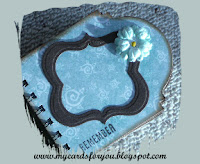
Paper flowers and a crochet flower have been added to some of the frames. The flower on this page was coloured by stamping Versamark ink onto the petals then dusting with Perfect Pearl powder (green). A yellow brad was added to the centre of the flower.

Background stamps have been used to provide a little detail to the pages. One page was stamped with glimmer mist which I first sprayed on a foam pad then stamped the background stamp on it to pick up the ink. Another page was stamped using white paint from a dabber which I applied directly to the stamp.

I also used a mesh stamp to provide some interest on this page.


Some of the pages use different techniques. For instance, the next page is made like an envelope. I folded the card before I cut it and placed the fold just inside the cutting edge of the die. I then cut the top of one side with a tab die (TH again!). I added a couple of cards to the envelope with some nice sentiments from Tim Holtz. (I got some new stamps recently and wanted to use them - this project seemed like a great opportunity!)


I added a little die cut with a nice sentiment to finish this page off.


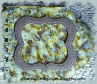
This page is made from a heavy card that I embossed with the patchwork quilt folder and inked up with shabby shutters, faded jeans, chipped sapphire and vintage photo. Added a little bird from Kaisercraft and a key cut with the cricut expression and rusted up with vintage photo distress ink and clear rock candy distress crackle paint.


This page is made from acetate which I coloured using alcohol inks in blue, yellow and green shades. Also added some metallic copper to give it a little depth. The acetate is attached to the base card with little dots of Glossy Accents. Amazing stuff as it does not show through the acetate.


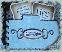
 This page has a lovely sentiment from Hero Arts - The future belongs to those who believe in their dreams.

I cut the tag with a nestabilities tag die and cut the backing by tracing around the outer edge of the die. This works really well to provide a shadow for these tag dies.

The flower centre is done by adding gold metallic beads with glossy accents.


The final page in the book explains the journey of the book. The sentiment stamp is from a Darkroom Door set and the poppies are from Montarga, stamped with rusty hinge and overlaid with a cute balls and sticks stamp (bundled sage) that I got from the lovely Wendy at The Stamp Attic in Wantage last year.


 This is one of a series of ATCs that I made some time ago. It is a tri-shutter ATC, measuring 3.5 by 2.5 inches when it is folded flat.

I used tattered rose and weather wood distress inks to colour the card and used the same inks to stamp the delightful little cogs (designed by Zoe!). The Eiffel Tower stamp was one I picked up at the Craft Barn last year - I think it is by Crafty Individuals. The ticket was cut around the ticket stamp - Tim again!!


I would love to contribute to the Craft Room's Challenge Design Team. I love using a range of different techniques and enjoy teaching other people about using them. I also think that it would provide me with some more challenges that I am really ready for. Enjoy!

Tuesday, May 17, 2011

Digital Stamping

I recently bought this digital stamp designed by Daisy Doodles from Card Making World. I loved the little toadstool house! I printed it out and coloured it with Copic markers then stamped the edges with Sue Law's cute dots stamp using Pumice Stone distress ink. I cut the shape with a nesties die and cut a backing piece to mount it on.

The backing paper is from Docrafts Daisy and Dandelion collection. I layered it on black then attached the ribbon. The sentiment is edged with Pumice Stone and cut from another nesties die.

The Tanda Teaser this week is Get Well Soon, so I think I will link it into the challenge there.

Monday, May 16, 2011

Another Challenge!

Ok I have been busy over the weekend - finally got into some of the challenge blogs and got busy! This one is for the Whimsie Doodles Challange this week. The challange was to use an image that is not coloured! I really like this stamp from Montarga which I stamped on glossy card with Versafine ink. It took ages to dry properly too!

I cut the image with a Nestabilities die and embossed the edge. I used the small die from the same set to cut the shape for the sentiment and embossed it then  coloured it with distress ink - Barn Door. The flowers were coloured with distress ink and I attached tiny buttons threaded with embroidery floss to the centres.

Do have a  look at the lovely sale Whimsie Doodles are having at the moment too. They have some beautiful digi stamps!

One for the boys!

Try it on Tuesday Challenge blog has a lovely one this week - One for the Boys.
I used distress inks - peeled paint, wild honey, rusty hinge and aged mahogany to colour the tag then stamped some "male" images on it - one from Tanda - an advert for fasteners and a saw and hammer stamp that was a really old school stamp from a friend. I cut a cog with the Tim Holtz Alterations Gadget Gears and embossed it with the clockworks folder. I then cut a tag from acetate and embossed it with the clockworks folder. Attached it to the tag with brads. The picture does not show it as well as it actually looks!

Card Sketch Challenge Card

This week, the Card Patterns Sketch challenge is a stunner. I loved the idea of the circular card with the pennants!

So I checked out my stamp collection and found something that might be very good with this sketch. The stamp I used is from Montarga - our very own Christchurch-based stamp manufacturing company which has relocated twice since the earthquake on September 4th 2010!

I cut the base card with the largest Spellbinders Nestabilities scalloped circle die - about 10cm across. The fold of the card is at the top and has been covered by a single piece cut from the same die. I also embossed the edges but not easy to see in the picture.
I then cut a 9.5cm circle which I stamped with Scattered Straw DI with a lovely dotty background stamp designed by Sue Law. Makes a perfect beach scene! I then masked it and brayered the sky with a multicoloured blue Versacolour ink.
The image was stamped then coloured with my copic markers and cut out. I layered it on the card with pop dots to give it some depth. The sentiment was cut with a nestabilities tag die and stamped. The pennants were attached to a ribbon then placed on the card.
A nice piece of fun for a cool autumn day!

Saturday, May 14, 2011

Motivated to create!

After attending a great workshop hosted by Sanzi in Auckland, I felt motivated to create again and after popping into a few of the forums and blogs I haven't been looking at lately, found some more inspiration.

This card was motivated by the Card Patterns Sketch 114. The die cuts were from the new Spellbinders dies I bought while in Auckland and the flower is from the stash that was in the goodie bag from the workshop.

I ran the red trim through the swiss dots folder on the Cuttlebug, stamped the flower with a word stamp and added a large crystal that I coloured with alcohol ink and covered with kindiglitz.  The sentiment is from a Hero Arts set.


Goodie Bag stash

This is the stash I got in the goodie bag. It included 2 Cricut Lite cartridges as well as a large pack of paper and card. I also won a Cricut Tool set and a magazine.


This is the stash I bought


At the workshop, Sanzi had a large number of accessories for sale and I bought several Spellbinders Die sets as well as some Tim Holtz Alterations dies. Altogether a very nice amount of stuff to bring home and play with!


These are some of the things we did at the workshop. It includes cards made with:
  • acetate, 
  • printed papers done on the Cricut Imagine
  • pop- up cut with a die
  • die cut card (grand spellbinders die)
  • cut-outs using the Cricut Gypsy
  • Cuttlebug embossing folders and inks.
We also used the Yudo Card Shop for screen printing an image (on the box).
It was a very well organised workshop and the presenters were amazing! Thanks Sanzi!

Thursday, May 5, 2011

It is May already... where is the year going?

I had to make a couple of cards for the Card Making World Monthly Challenge again. The theme this month is Make a Shape - other than square or rectangular! I chose to do this pyramid card - I think the original idea came from a Craft Stamper magazine. It was a bit complicated to put together, but once I got it worked out - it seemed to work OK. I used a Happy Birthday background stamp on the card before I put it together to make it easier to stamp. Once it was assembled, I used three or four colours of distress inks to give the shading on the card. I love the Bundled Sage with the Rusty Hinge and Wild Honey distress inks.
The rosette was made with a Tim Holtz die and coloured before putting together.


The second card for the monthly challange was made by cutting a folded card with a nestabilities label die, then cutting several more layers. The image is from a Victorian CD and coloured with Copics. I used Pumice Stone to provide the shading around the image and the layer underneath.

I embossed a dark green layer then attached the other two layers to it, applying the whole to the base card. I tied the ribbon with the bow maker that my clever OH made for me! Makes tying bows really easy too...


 I made this card for a friend. The image was stamped on card then a wax resist applied using embossed waxed paper ironed onto the card. A layer of distress ink was then applied to produce the patter on the background of the image. I covered the show with flowers and leaves and coloured the ribbon in a darker purple.
 I scalloped a piece of black card for the background layer to the image then laid them onto a background embossed with the same folder I had used for the wax resist layer. Attached a scalloped ribbon to the bottom of the layer then attached to a square card.

The sentiment is from a Tim Holtz set and reads: Friendship can not be measured, only treasured.

I thought this little house was really cute when I saw the template on Stephanie Novatski's website.

I cut the base out of brown card then cut layers for the front, back and sides from the same card. These I textured with an embossing folder and the Cuttlebug. I added some lace curtains to the windows and rubbed some gold paint into the embossed door.

The fence was coloured with Picket Fence Distress Crackle Paint and layered onto the house. The trees were stamped with a freebie from Craft Stamper and the birds and bird house were from a stamp set designed by Sue Law.

The roof of the house was cut from thick crimped card and attached to the house.